TRAVEL · Web platform and design system
Two audiences, one site, and no database to run it.
LTX Hub distributes hotel inventory between global wholesalers and regional agencies across Central and Eastern Europe, the Balkans and Asia — two opposite value propositions arriving at the same address. Coderlytics built its marketing and partner-onboarding site: an ASP.NET Core application on .NET 10 with its own design system and a two-step partner sign-up, holding no customer data, because partner authentication already lives elsewhere and every submission leaves as e-mail.
At a glance
| Product | The marketing and partner-onboarding site for LTX Hub |
| What the business does | Romanian B2B travel distribution — connecting global hotel wholesalers with regional agencies across Central and Eastern Europe, the Balkans and selected Asian markets |
| Who uses it | Supply partners looking for distribution, demand partners looking for inventory, and the LTX Hub onboarding team who answer them |
| Engagement | Client site. Coderlytics built and now maintains it |
| Timeline | April to September 2026, in three increments |
| Application | ASP.NET Core MVC on .NET 10, C#, Razor views, server-rendered |
| Front end | One hand-written design system over stock Bootstrap; 38 lines of site-wide JavaScript, no framework |
| Data | None. There is no database and no user accounts — every submission leaves as e-mail |
| Hosting | Microsoft Azure App Service, deployed from GitHub Actions over OIDC |
The problem
LTX Hub sits in the middle of a two-sided market. On one side are hotel wholesalers with inventory they cannot place in Bucharest, Sofia, Chisinau or Tirana on their own. On the other are regional agencies who want live rates and availability without building a connection to every supplier themselves. LTX Hub contracts the supply and distributes it.
That shape is a problem for a website. The two audiences want opposite things — one wants reach, the other wants inventory — and they arrive at the same address. A site that speaks to one of them loses the other; a site that hedges speaks to neither.
There was a second constraint, and it turned out to be the useful one. Partner authentication already existed: agencies sign in to a booking platform LTX Hub does not own, and supplier accounts live with the supplier. Nobody wanted a second account system, a second password reset, or a second place where partner data could sit. The site had to convert and hand off — and hold no customer data of its own.
The brief: one site that tells both partner stories without diluting either, captures enough detail for onboarding to act on, and keeps nothing it does not have to keep.
What the site does
Six pages, each with one job.
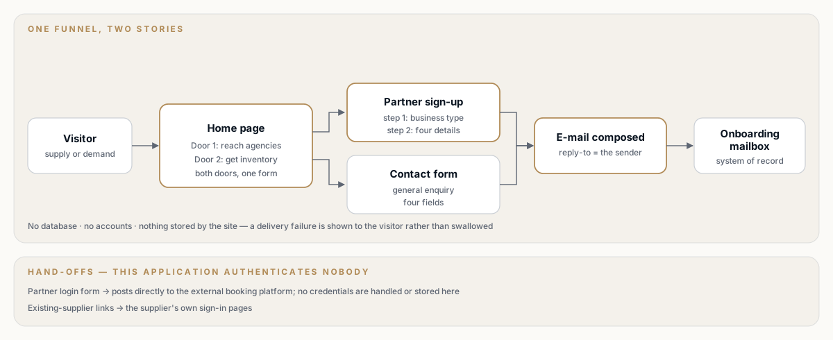
Two audiences, one funnel, and a hand-off instead of a login. Select the diagram to open it full size.
| Page | Job |
|---|---|
| Home | Split the two audiences without splitting the site, then send both to sign-up |
| About | Answer "why you" for a partner weighing a multi-year integration |
| Contact | Capture a general enquiry with a reply-to that works |
| Sign-up | Capture the five details onboarding needs to price a partnership |
| Partner login | Get an existing partner to the platform they actually use, in one click |
| Privacy | The legal page the two forms make necessary |
The home page splits, then converges. A "two-door" section runs the supply story and the demand story side by side, each with its own three points and its own call to action — and both doors lead to the same sign-up form. Above them, an animated coverage map shows the network the visitor would be joining: Bucharest at the centre, nine markets on three tiers, drawn from the markets LTX Hub can actually execute in rather than a list of countries.
The sign-up asks the question a dropdown was hiding. Business type drives everything downstream — a hotelier and an online travel agency get different partnership plans — but it was buried in a nine-option select that visitors skimmed past. It is now the first and only thing on screen: nine tiles with icons, one click, and the form appears with the choice already made.
The contact form is deliberately smaller. Four fields, a reply-to address set to the sender, and a card next to it saying plainly that sign-up is usually the faster route.
Partner login is a hand-off, not a login. The form is rendered here, styled here, and posts directly to the partner platform's own endpoint. This application authenticates nobody.
Why it is built this way
1. No database, because there is nothing to store. Both forms produce an e-mail and nothing else. That removes a database, its backups, its connection string, its migrations and its personal-data retention policy from the site's operating surface. The trade-off is real and accepted: there is no record of a submission inside the site, so the mailbox is the system of record and a delivery failure is a lost lead. The forms are written so that failure is surfaced to the visitor rather than swallowed.
2. Authentication stays where it already is. There is no UseAuthentication() in the pipeline and no authorization attribute anywhere, because partner credentials belong to the platform that issues them. The site never sees a partner password. The trade-off: the login page's behaviour depends on an external endpoint the site does not control, which is why a test asserts it still points there.
3. Server-rendered, with the JavaScript kept to what needs it. Razor renders every page. The whole site ships 38 lines of site-wide script — a sticky mobile call to action — plus a small enhancement on the sign-up page. The two-step picker is progressive: the model-bound select is still there underneath, so the form works, validates and re-displays correctly whether or not the enhancement runs.
4. A design system, not a theme. Colour, type, spacing and radii are tokens on :root, redefined at three breakpoints so the type ramp compresses rather than reflows. The palette is sampled from the logo artwork. Bootstrap stays underneath for the grid and form controls; the design system sits on top rather than fighting it. The trade-off: 1,669 lines of CSS in one file is more to own than a theme, and it is the reason a new page takes an hour instead of a day.
5. Deployment is a decision, not a consequence. Continuous integration runs on every push and every pull request. Deployment runs only when a human dispatches it. Merging to main ships nothing, on purpose, and the workflow says so in a comment so the next person does not "fix" it.
How it works
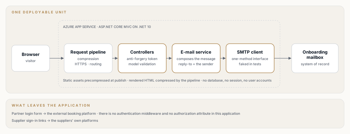
One deployable unit, one outbound dependency, and two deliberate hand-offs. Select the diagram to open it full size.
Follow one sign-up through the system:
- Arrival. The request hits Azure App Service. Response compression runs ahead of anything that writes a body, HTTPS redirection and routing follow, and the default controller route resolves the page.
- The choice. The visitor picks a business type. The tile writes the value into the model-bound select and reveals the rest of the form.
- Validation. The post is checked against an anti-forgery token and the view model's data annotations. Anything invalid re-renders the same view with the visitor's answers intact — and, because the enhancement checks for server-side errors, on the step where those errors are.
- Composition. The controller hands the model to the e-mail service, which composes a plain-text message with the sender's address as the reply-to, so answering the lead is a reply rather than a copy-and-paste.
- Delivery. The SMTP client sends it to the onboarding mailbox. Success redirects back to the page with a confirmation; a failure is logged and shown as an error the visitor can act on, rather than a silent success.
Everything else is a hand-off. The partner login form posts straight to the booking platform. The "I already have an account" links go to the supplier's own sign-in pages. The site's job ends at the boundary.
Engineering challenges we solved
A nine-option dropdown that was costing the answer
The risk with replacing a select with a tile grid is that the form stops working the moment anything goes wrong — a validation failure that re-renders on the wrong step, a retained answer that disappears, a browser where the enhancement does not run.
- The select never leaves. It stays model-bound and required. The tiles write to it; they do not replace it.
- The form remembers where it was. On re-display the script checks for a retained selection and for server-side validation errors, and opens on step two if there is anything to see there.
- Going back is free. A back control returns to the picker without losing what was typed.
- One optional field, on purpose. Under nullable reference types a non-nullable string would have picked up an implicit required rule, so the one genuinely optional field is declared nullable and carries a comment explaining why.
The result: the question that decides the partnership plan is answered first, and the form still behaves like a form.
Making a brochure site load like one
The risk: a marketing site accumulates weight — a map, web fonts, a framework — and the people it is aimed at open it on a phone in an airport.
- The map is generated, not embedded. A build-time script draws the coverage map from public-domain Natural Earth geometry into a self-contained animated SVG. It fetches the source data when the script is run, never at build or request time, and the output has no runtime dependency.
- It is one repetitive path, so it compresses. The file is roughly 95 KB on disk and travels in under 3 KB.
- The rendered HTML is compressed too. Static assets are already precompressed at publish time, but that does not cover the pages the framework renders. Brotli and gzip take the home page from about 16 KB to about 4 KB.
- Compression over HTTPS was a considered decision, not a default. Compressing a response that carries a secret is the surface a known attack targets. It is enabled here because the site redirects to HTTPS — so compression would otherwise never apply at all — and because the only secret in these responses is the anti-forgery token, which the framework already randomises per response for exactly this reason. The reasoning is written into the code, with the condition that would invalidate it.
- Fastest, not best. Both providers run at their fastest level: the slower setting costs more in latency than it saves in bytes on pages this size.
- Motion is opt-in. The map's animation is wrapped so that it runs only where the visitor has not asked for reduced motion, rather than being switched off after the fact.
The result: a home page with an animated world map on it that arrives in about four kilobytes.
Tests on a site with almost nothing to test
The risk on a brochure site is the familiar one — nobody writes tests, and then a rename quietly breaks the one form the business depends on.
- 56 automated tests, run in Release on every push and pull request.
- The mail path is faked, not mocked out. Sending sits behind a one-method interface, so the e-mail service's composition — recipients, subject, reply-to, body — is asserted in full without a message ever leaving.
- Both failure paths are covered. An invalid model re-renders with the same model; a delivery failure produces a logged error and a message on screen.
- Markup is tested where behaviour lives in it. The partner login form has no controller action to test — its behaviour is the endpoint in the view. A test reads the Razor file and asserts it still posts there, so a tidy-up cannot silently break the hand-off.
- Configuration refuses to start half-configured. The e-mail service validates its settings and throws a named error rather than failing somewhere inside the SMTP stack.
The result: the two things that earn money on this site — a form that sends, and a login that lands — both fail loudly in continuous integration rather than quietly in production.
A URL that shipped with a typo
The sign-up page went live at a misspelled URL, and partners had already shared the link.
The action for the old spelling is still there and now issues a permanent redirect to the correct one. A test asserts the redirect is permanent and points at the right action, and a comment records the condition for deleting it: once the old link is confidently out of circulation. Old links keep working; new links are correct; the clean-up is a decision someone can make later with the evidence in front of them.
How Coderlytics delivered it
Three increments, five months, nothing half-finished in between. The site was delivered in stages, and each stage ended with something live.
Automation before features. Continuous integration landed two weeks after the first commit, before there was much to break. Deployment followed immediately after, and was moved onto federated credentials rather than a stored publish profile in the same month, so there is no deployment secret in the repository to rotate or leak.
The pipeline tells you what is wrong. A misconfigured deployment used to fail about forty-five seconds in, inside the cloud login step, with an error that pointed at the wrong cause. A preflight step now checks the required repository secrets first and fails in seconds naming exactly which ones are missing and the command to set them.
Upgrades taken deliberately. The move to .NET 10 came with a pinned SDK version, so a machine on the previous major version refuses to build rather than quietly producing a different result. The same increment expanded the test suite rather than merely keeping it green.
| Increment | What shipped |
|---|---|
| April 2026 | The site's foundation: layout, pages, brand assets; the contact form with SMTP delivery and its first tests; continuous integration and a manual deployment pipeline, moved onto federated credentials the same month |
| August 2026 | Partner sign-up: the view model, validation, e-mail delivery and the partner and supplier hand-offs |
| September 2026 | Upgrade to .NET 10 with a pinned SDK and an expanded suite; the misspelled sign-up URL fixed behind a permanent redirect; the design system applied across every page; the two-step business picker; the generated coverage map; response compression; the deployment preflight check |
The September increment is complete and green in continuous integration. The design system, the two-step picker, the coverage map and response compression are awaiting their review and their manual deployment — which, on this site, is the point: shipping is something a person decides to do.
By the numbers
| Delivery window | April – September 2026 |
| Routed pages | 6 |
| Automated tests | 56 |
| Design-system CSS | 1,669 lines, one file |
| Site-wide JavaScript | 38 lines |
| Coverage map, on disk / on the wire | ~95 KB / under 3 KB |
| Home page, uncompressed / compressed | ~16 KB / ~4 KB |
| Databases, user accounts, stored passwords | 0 |
| Deployable units | 1 |
Figures as of September 2026.
What comes next
- The privacy policy. Two forms collect personal data, so the placeholder page needs real content — what is collected, the lawful basis, how long it is kept, and who to contact — before the site takes production traffic.
- Image weight. The logo is served as a large raster file and is the single heaviest asset on the page. Resizing it and serving a modern format would take more off the wire than every other optimisation on this site combined.
- A second look at the mailbox as a system of record. It has been the right call so far. If lead volume grows to the point where "did we answer that one?" becomes a real question, that is the signal to revisit it — not before.
What this shows
Most sites like this one are built in a page builder, and most of them are fine. This one exists because a B2B distribution business has to explain two opposite value propositions to two audiences without diluting either, and because the cheapest data to protect is the data you never collect.
The approach carries: decide what the site is genuinely responsible for and hand off the rest; let the thing that decides the conversation be the first thing on screen; put tests on the two or three paths that actually earn money, including the ones that live in markup; and make deployment something a person chooses to do.
If you have a site that is doing less for your business than it should — or one that quietly collects more than you want to be responsible for — talk to us.
Work with us
Planning a platform that has to be right on day one?
Tell us what you are building. We will come back with how we would architect, deliver, and operate it.
← Back to Work